Main Content
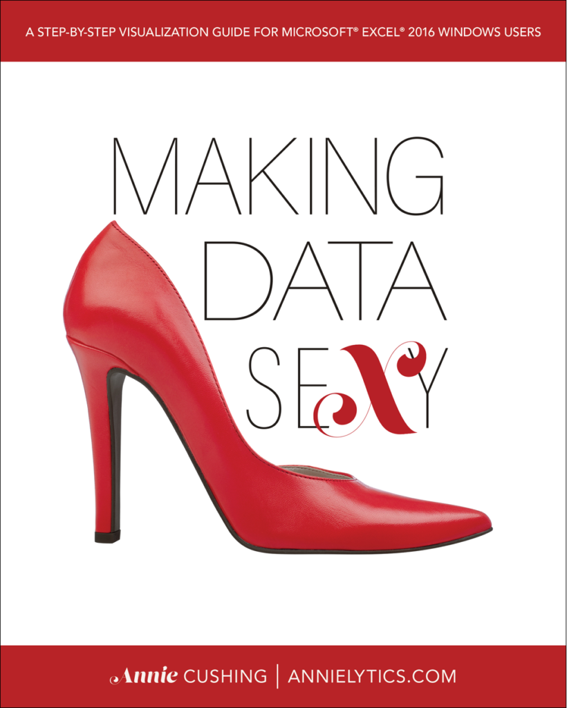
Making Data Sexy Is Live!
There are a lot of Excel books on the market. So why write another one? (Two actually! One for Windows and one for Mac.)
First of all, most Excel books are published in black and white. Ergo, they can’t focus much (or sometimes at all) on the art of data visualization because you can’t say, “Imagine that lighter gray is orange, the dark gray is blue, and the murky gray is…well, that’s actually gray.
Making Data Sexy is a comprehensive, full-color book with more than 500 screenshots and diagrams.
Catwalk
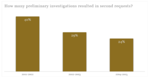
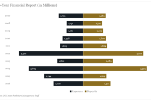
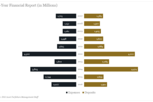
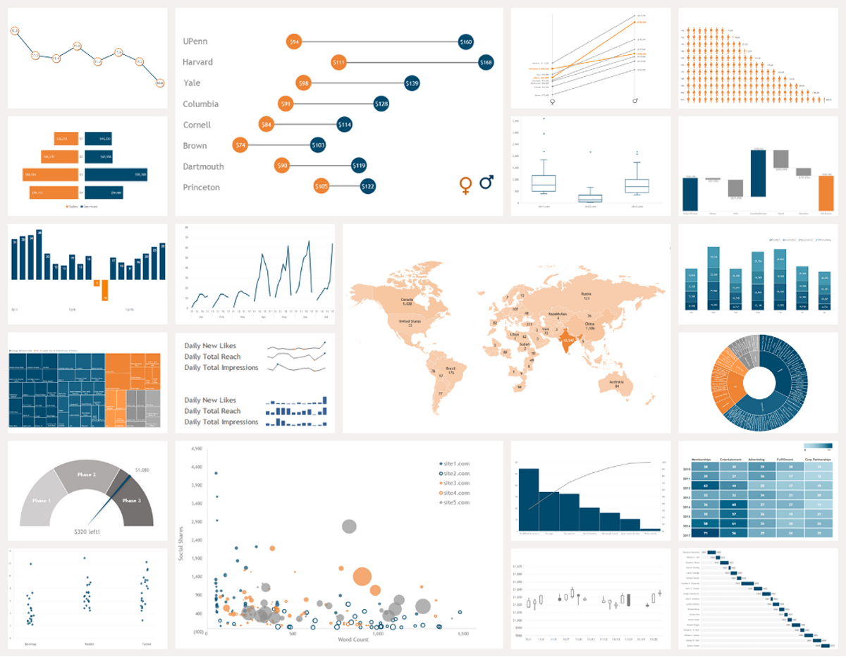
To whet your appetite, below is a small sampling of some of the charts you’ll learn how to create in the book. Each of these charts—as well as the other 40+ charts in the book—uses a branded palette of only three colors.
Features
This book focuses exclusively on data visualization. Although you will learn how to rock formulas to clean and organize your data, create and design pivot tables, and create themes and templates to automate your workflow, the overarching focus of this book is on data visualization. To that end, some of the more notable features of the book include:
- There’s a version for both PC and Mac users. Mac users are almost always overlooked with Excel guides. Not with Making Data Sexy.
- The focus is on creating elegant, branded visualizations. You will learn to rid your charts of distracting (and ugly!) pixels, such as gridlines, busy axes, etc. Every visualization in the book is created from a three-color palette to demonstrate that even the simplest of brands can create visualizations that align with their branding.
- You will learn to hack Excel. Microsoft never intended us grabby little Excel users to be able to create really cool charts, like the slope, dumbbell, bikini, gauge, segmented scatterplot, etc. But you will learn to hack obscure settings in Excel to make these hacktastic charts possible. And I explain why every step of the way. If I tell you to go into the Error Bars setting, I explain why we’re using error bars to create our lollipops or a connected scatter plot to add a mean line to our chart.
- Tutorials are written in plain English. When learning a new skill, there are few things as frustrating as going through the motions of a tutorial without understanding the strategy. In Making Data Sexy, you will learn the why behind the how in every tutorial. To ease you into the tutorials for the more complicated charts, I include a “Hundred-Foot View” section, which is designed to put you in the catbird seat so that you will feel more confident when I ask you to do something ridiculous…like shoehorn a pie chart into a donut chart like it’s some kind of host organism. 👀
- The book is scannable. Paragraphs have been replaced with bulleted lists and numbered steps whenever possible to make consumption as easy (and fast) as possible.
- The tone is light. The writing style is fun and even pokes fun at Excel at times, with its Bubblegum-colored crayons, volatile proclivities, missing menus, and sundry other idiosyncrasies.
- You will learn to automate. Manual workflows lead to errors, departures from branding, and wasted effort. You’ll learn how to create themes, global templates, and chart templates that can be shared across an organization.
- You can follow along with the data used in the book. If you’d like to follow along with the data used to create each of the 60+ visualizations, you can download the data for free.
Chart Picker Tool
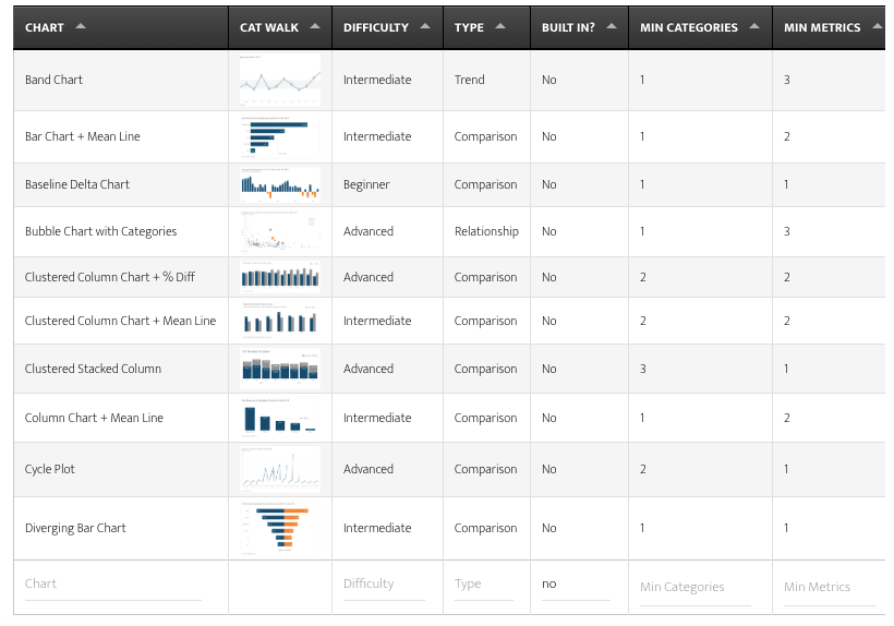
Need to create a chart but can’t decide which one to go with? Use the Chart Picker tool to help you narrow your options.
Tutorial Breakdown
When you get to chapter 5, where all the visualization tutorials are, each chart type has a predictable group of sections:
- AKA: Learn other names a chart type might go by.
- Uses: Learn potential uses for each chart type.
- Tips: Learn about potential design gaffes to avoid, pivot table requirements, limitations, crash warnings, alternative charts should your data not work, etc.
- Category/Metric: Learn how many categories and metrics each chart requires. There’s no sense chasing down a cool chart, just to find out your data doesn’t meet the minimum requirements.
- Tutorial: Learn how to create each chart type with illustrated steps.
- Variation(s): Learn how to add finesse some charts with optional enhancements.
- Example File: Learn the filenames for the free raw data and/or optional full Excel files.
- Template(s): Learn the filenames for the chart templates available for purchase in the store.
Set It And Forget It? Really?
Yes, that’s correct. You will learn the importance of starting with a theme. You’ll learn how to use your branded colors and fonts to create this theme that you’ll build all your visualizations from. And if you’re a Mac user, you’ll learn some pretty crazy hacks and workarounds to compensate for some of these missing settings.🤦♀️
I also show you how to customize Excel’s formatted tables and pivot tables to align with your branding, as well as the hacks you’ll need to know to apply them across workbooks (sadly, not a built-in feature). With these tips, tricks, and straight-up hacks, you’ll be able to build a global template that you can distribute throughout your organization to ensure all visualizations align with your style and branding guides.
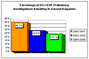
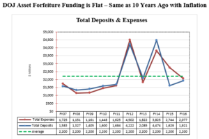
You’ll see how I use the U.S. Department of Justice as a cautionary tale to illustrate the importance of aligning all of your visualizations with your brand. I even take a couple of the visualizations they’ve published on their site and offer some alternative visualizations, using their *amazing* branded colors and fonts. I start with this bright-and-cheery chart (honk if you love neon 3-D charts!) and offer a couple alternative charts using the DOJ’s actual colors.
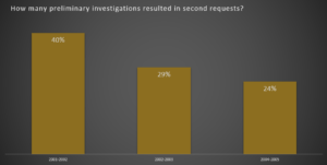
And then we get a little more amped up with some alternatives to this this other chart—that bears no similarity to the other non-branded chart.
Optional Purchases
Chart Templates
Although I highly recommend learning to create all the charts in the book, one shortcut to mastery is to purchase the template files and customize them to align with your branding. Not all charts can be saved as templates at this time (such as all the charts introduced in the 2016 version of Excel). And some are too hacktastic to be saved as chart templates. In those cases, I offer alternative solutions to creating your favorite charts from scratch each time.
Excel Files
If you want to see the pivot tables I created to organize the sample data, as well as the final visualizations, you can purchase the final Excel files.
Every chart has its own file to keep things easy and well organized.
Bundles
There are a number of bundles you have to choose from in the Store.
